I’ve been working through how to present ThoughtCounter at the interim show. The challenge is how to document the research while making space for visitors to participate themselves.
The plan
Here’s a detailed mock up of how the work could look on an A-frame. The visual language is neutral enough to let people focus on reading the survey responses and decide whether they want to participate themselves. I like it’s simplicity.

Updated A5 size post investigation survey:

And the instructions for show visitors:

Feedback from Berta
I ran the layout past my friend Berta, who works at a gallery. She gave me some useful reference points:
- Midpoint for paintings at Tate: 1.45m (can go up to 1.50m)
- Standard cap height for wall titles: 25mm
More importantly, she flagged an accessibility issue I hadn’t considered. ThoughtCounter is participatory – people need to physically click, write responses, stand at a specific height. What about visitors who can’t write? Or can’t stand for the full minute? Or can’t click? I don’t have a solution yet but I’m thinking about it.
Berta also suggested I read Bourriaud’s Relational Aesthetics (1998) – relevant because of the participatory nature of the work.
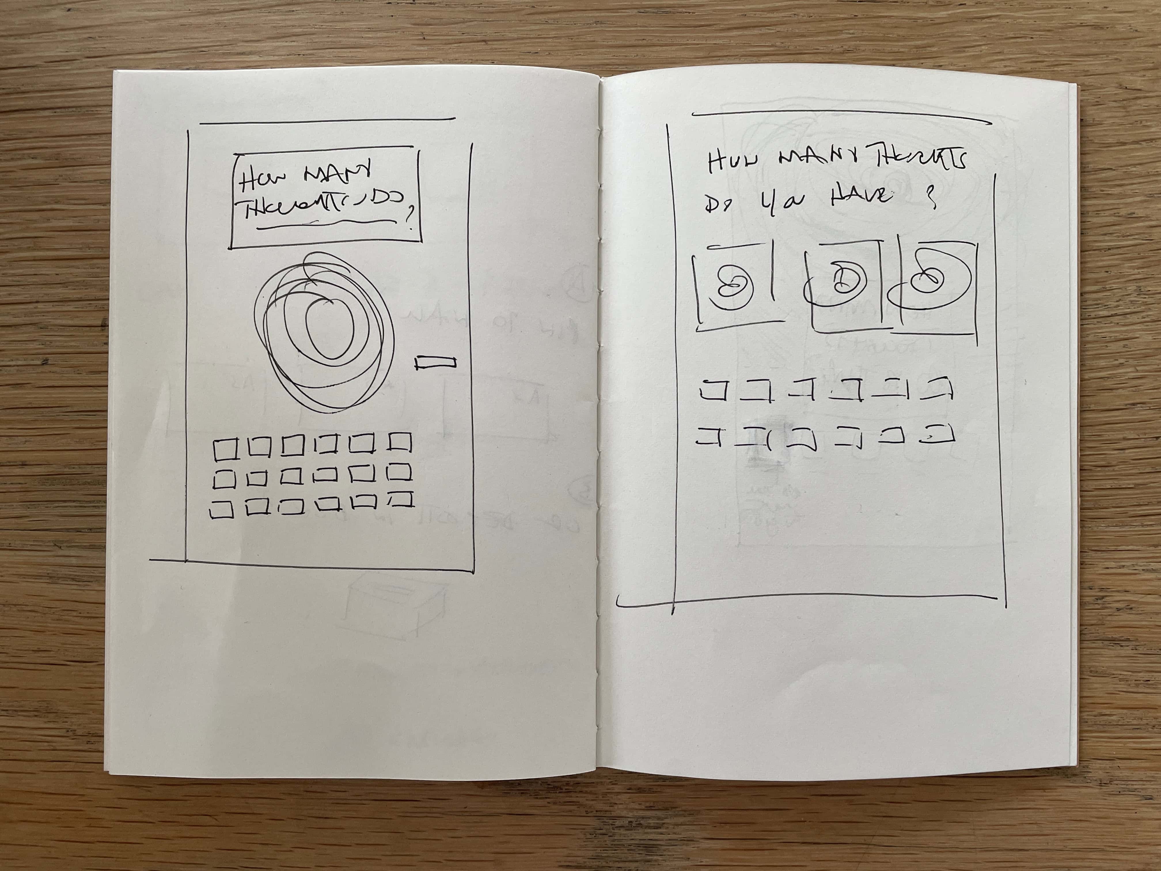
Arriving at the A-frame layout above was a bit of a process – here’s how my thinking evolved:
First attempts: Moiré + headline + responses


I started sketching ideas for an A-frame display that would combine:
- Large moiré pattern (visual hook)
- The key question as headline
- Grid of completed questionnaires
- Materials for visitors to participate (counter, pen, ear plugs, forms)
The moiré pattern felt right – it draws you in, creates mystery and signals this isn’t a standard survey.
But when I mocked up some crude options in Photoshop (below), it felt quite busy. More importantly, it created an unclear hierarchy – it might not be clear to the viewer which is the real artwork – the moiré pattern or the survey responses?


Stripping it back

I sketched a simpler version:
- The question (smaller font size)
- Grid of questionnaire responses as the primary visual
- Shelf with materials (instructions, counter, ear plugs, pens, blank forms)
- Empty space below the shelf for completed surveys to accumulate during the show
This felt immediately better. The focus shifts to what people discovered when they tried to count their thoughts.
The moiré pattern can live in the phone presentation and it already does its job there as the opening slide. It doesn’t need to be on the wall.
Raven Row: Conceptual art and Christine Kozlov
Yesterday I visited Raven Row to see their new show: Conceptual Art and Christine Kozlov. The timing was perfect.


Kozlov’s Information: No Theory series featured clean, typed text on paper, mounted simply.


On Kawara’s paintings featured black canvases with white text, nothing else. The entire show reinforced the ‘less is more’ principle. Simple materials, clear presentation, total confidence in the idea.
Next steps
- I have a tutorial scheduled with Betty tomorrow and I’ll run the detailed mock up past her and refine from there.
- Address the accessibility point
- Read: Bourriaud’s Relational Aesthetics