My friend Ben was the first person I tested the ThoughtCounter interim show materials with. He’s a designer who meditates regularly, so I knew he’d give thoughtful feedback. The session raised several important issues and clarifications.
The clicking problem
Ben: “If the person clicking is also asked to keep count, it dilutes the efficacy of how accurately they can observe, because they are trying to count as well.”
He’s 100% right – clicking AND counting splits the attention.
Solution: Use a clicker that counts automatically. This way participants can focus entirely on observing their thoughts rather than keeping score.
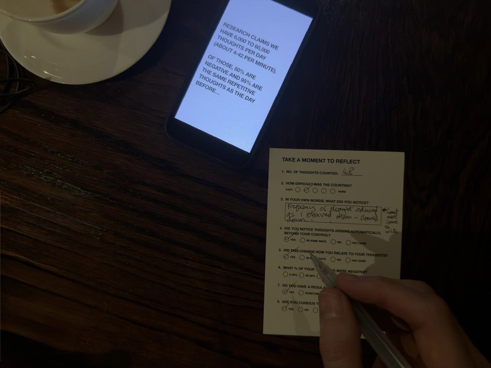
The “negative thoughts” question
Ben: “I think question 6, what % of your thoughts were negative?’, needs some thought around it, I find that hard to answer because at the beginning I was anxious about being accurate, about clicking. And then I remembered thinking I’m thinking quite quickly, probably because I’m anxious about how many thoughts I’m having and am I doing it right. That could be perceived as negative, but it could also be perceived as consciousness. I feel like it’s hard to bracket thought in positive or negative – it’s too binary.”
This is interesting. However, the difficulty of categorising thoughts might itself be the insight. If you can’t tell whether your thoughts in one minute were negative, imagine what that looks like across a day. It points to how unaware we are of what’s actually happening in our minds.
Ben: “Yeah, I can’t even remember what the thoughts around the middle actually were.”
Exactly – the forgetting is part of the discovery.
Solution: Keep the question as is. The struggle to answer it reveals something important.
Space for reflection
Ben: “I wish there was more space to respond to question 3. Maybe that question should come at the end and you can say to people to write on the back if necessary.”
Solution: Move the open-ended “what did you notice?” question to the end of the questionnaire. Switch from A6 to A5 to give more writing space without needing people to flip the card over.
Headphones?
Ben: “Yes, it would be easier. It will help you go more inward. You might not even need headphones – almost really good ear plugs. You’re blocking out one of the senses. It just helps you focus.”
Solution: Test both – some participants with noise-cancelling headphones or earplugs, some without. See if sensory reduction changes the experience.
The aesthetics
I asked Ben what he thought of the minimal black-and-white design.
Ben: “You’re triggering an insight – that is the art, that is the beauty. You’re revealing the ultimate truth to them, so you cannot visually represent that. The more neutral it is, the closer you get to the truth.”
This is excellent justification for keeping the presentation stripped back, so the visual language doesn’t compete with the discovery.
Ben: “The realisation of the participants – that’s the art here, that’s the beauty. You’re actually showing people the reality of what their minds are really like.”
Next steps
- Source a clicker that auto-counts
- Redesign questionnaire as A5 with more space for written responses
- Move open-ended question to the end
- Test with/without headphones or earplugs
- Keep the visual design minimal
Open question for the show: If I display completed questionnaires on the wall, will seeing other people’s responses bias visitors who try the exercise themselves? Does that matter?
Updated slides
I’ve updated the slides as per the above actions, and added the question, “what’s your prediction?” – this highlights the gap between actual & prediction.