Following my catch up with Jonathan, I ran some quick experiments exploring mark-making, three-dimensional forms, and colour – to see what directions felt worth pursuing further.
Mark-making test
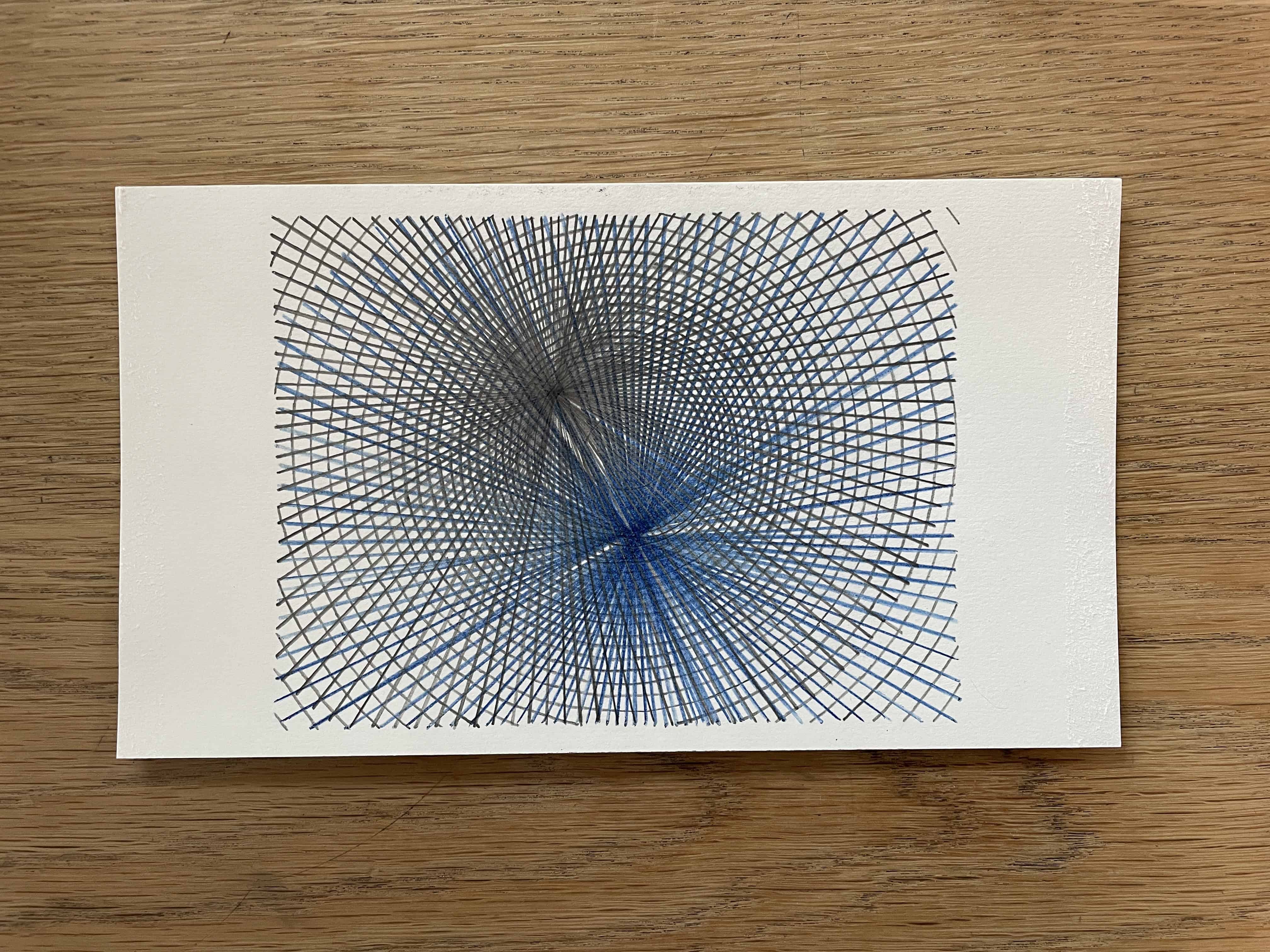
I traced one of the moiré pattern combinations using two different coloured pencils. It was a slow but meditative process and took just under two hours to complete.


I tried to be meticulous in my mark-making, but it became increasingly difficult to track the lines of the bottom layer. Because of this – and the line thickness of the pencils – the most interesting and detailed part of the original pattern in the centre wasn’t really replicated.
Original pattern:

Reflections: While the process was meditative, the result lacks the precision and punch of the printed versions. The hand-drawn quality softens the effect too much – it loses the crisp contrast that makes the moiré patterns work.
Cut and form acetate into cones
This was a quick experiment. I cut the perimeter of two acetate sheets featuring pattern #5, then cut a line at 90 degrees from centre to edge on both to create two cones with the pattern on the inside.


The goal was to create an immersive tunnel effect. It worked to some extent and produced interesting swirls and movement, but I prefer the simplicity of the original flat version and also the oganic seed/egg type shapes that version produces.
Original pattern:
Reflections: The cone creates distortion and additional complexity, but it also muddies the clarity of the moiré effect. The flat, layered version feels more focused and powerful – the effect is cleaner without the added dimensional warping.
Colour test
I started colouring in some of the shapes of this pattern but just found it so boring. It just felt very slow and laborious.
I love the pattern itself, but I’m not sure what the colour adds. I think it’s because I want to create work that really comes alive and stimulates the viewer’s perception. With enough work, the coloured version might look pretty, but it’s lacking any real punch IMO.

Reflections: Colour feels like it dilutes rather than enhances whereas the black-and-white creates the strong contrast and allows the moiré effects to do their work.
Overall learnings
These quick tests clarified what doesn’t work as much as what does:
- Hand-drawn mark-making loses the precision that makes the moiré effects so compelling – though the process itself was meditative
- 3D cone forms add complexity but reduce clarity – the flat layered approach feels stronger
- Colour softens rather than intensifies