I visited a James Turrell show yesterday and it’s made me rethink the visual direction of ThoughtCounter.
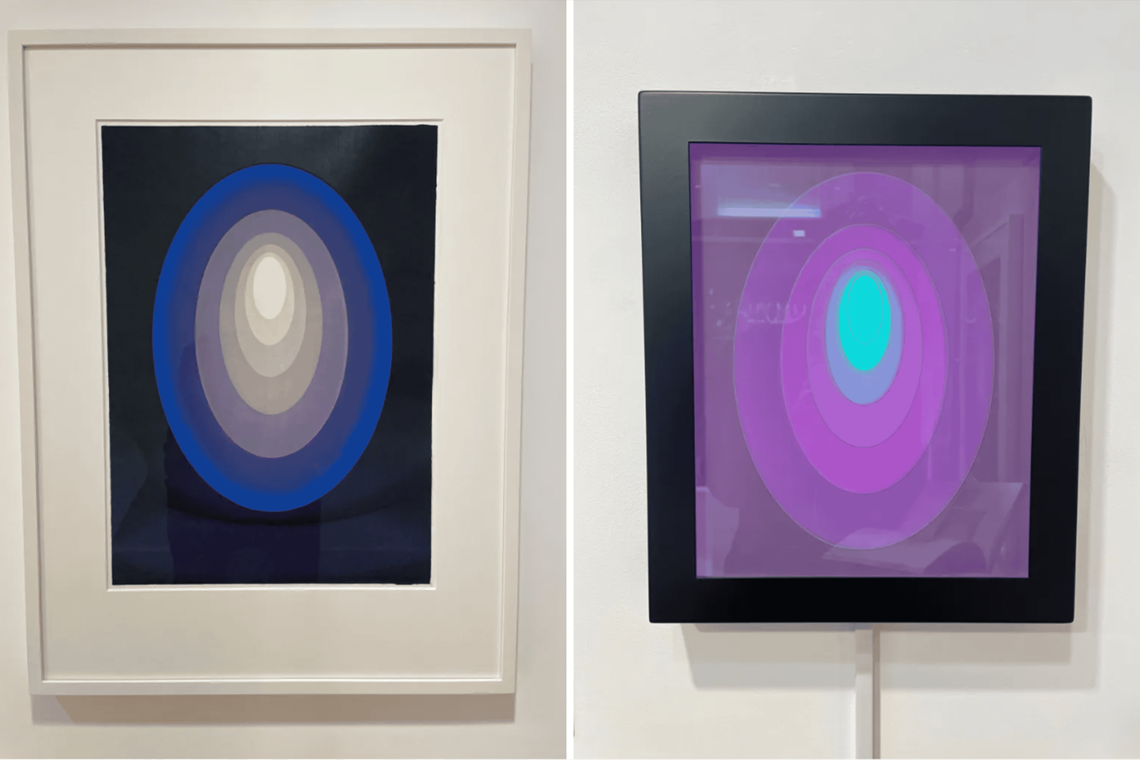
It’s obvious that a woodcut etching and a digital screen will evoke completely different experiences. However, seeing them alongside each other (at Gagosian, Burlington Arcade) really hit home how disappointing the digital screen was in comparison to Turrell’s typical work.
The etching (on the left) is so much stronger. The screen flattens everything – the depth and in a way the beauty is gone. Turrell is one of my favourite artists but it was sad to see his work diminished on screen through this collaboration with a perfume brand.
It made me think about ThoughtCounter’s digital interface and helped me see two problems with the current design more clearly.
The moiré problem
At the start of the course I produced moiré experiments (here & here) by overlaying patterns of printed acetate sheets. There was something alive and imperfect about the subtle, unpredictable movements created as the sheets were manually shifted over each other.
Seeing the patterns translated into digital animation (below) on the Figma design files, it feels like the patterns have lost some of their heart/soul in a way. The animation feels flatter perhaps because it was digitally coded, or maybe it’s the cropping/bleed around the edges. Either way it feels like some of the human unpredictability is lost.

I don’t know the specific answer to this at this point in time, but I’ll discuss with the developer to hear their input. It might require a few more tests.
Font & colour scheme
The Helvetica font isn’t working either – it feels too close to standard iPhone graphics, particularly on screen 3 (below).

This is completely on me for suggesting the font, but seeing it in situ it’s clear it’s not right for what I have in mind. I want something that feels more editorial and considered – closer to something you’d see in a gallery or art publication than a tech product.

For the core text pages I’d like to strip the colour back to black and white entirely – removing the orange accents and highlights. Colour should be reserved for the animated visuals only. Like a gallery wall that stays neutral to let the work speak for itself.
The developer I’m working with referenced the Collecting Europe V&A website as a good direction and I agree – it’s more refined and nearer to the overall look and feel I’m after.

Key learnings
What I’m looking for from the visuals is something that draws you in without distracting you – supporting the investigation rather than competing with it. The current animation feels a bit too flat and one dimensional. I want to explore how we can bring more depth and movement to it.
There’s also the question of retaining the human, unpredictable quality that made the original physical moire patterns work. That slight imperfection in the movement felt alive because it was made by hand. That’s what the digital version is currently missing and what I want to find a way to bring back.
Main image:
- Left: ten Reign Blue, James Turrell, 2014
- Right: Crystal Light Panel, James Turrell & Lalique, 2022