Building a visual identity for consciousness research.


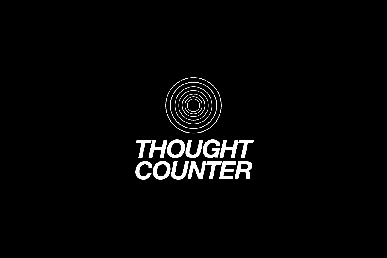
I’ve landed on this logo-mark for the moment. The font is inspired by the cover of one of my favourite (and very cosmic) books “Stalking the Wild Pendulum” which was published in the 1970’s.
I want the ThoughtCounter logo to feel fresh, crisp, clean and dynamic. Not safe, stale ‘spiritual’ or fluffy in any way. ie. A new way to consider our thoughts.
Helvetica Neue font has made a massive comeback in recent years and we used a version of it for the Everpress logo-mark and branding. It’s clean, bold and evokes the 1970’s movement towards consciousness exploration.
The concentric rings in the logo reference the moire patterns from my previous experiments which will be used for the ‘counting’ animation. There are seven rings in total, pointing to the seven states of consciousness which appears in Vedantic philosophy and other wisdom traditions.
Design reference: Stalking the Wild Pendulum


The original cover (designed by Terrence Fehr, illustration by Toni Taylor) used bold geometric typography and a pendulum visualisation that captures the book’s exploration of consciousness as a “vibrational universe”. That blend of science and spiritual inquiry is exactly what I’m aiming for with ThoughtCounter.
The cover’s bold, confident typography paired with its circular geometric forms creates a visual language that says “this is serious investigation into the nature of reality”.
Initial logo-mark ideation

My first attempts were literal – thought bubbles – the obvious visuals for “thinking.” But this did lead me to noticing the natural link to the moire patterns.
The concentric rings also reference:
- The meditative, cyclical nature of the practice itself
- The near impossible task of “catching” thoughts as they ripple outward
- The seven states of consciousness in Vedantic philosophy

The second phase I played with a few options, refining the weight of the rings, the spacing, and how they interact with the typography. It came together quickly once I had the core concept.
Ultimately, the logo-mark needs to work in multiple contexts – on a data research website, potentially on a product page that might be satire or real, and in an art installation. I feel like the logo mark can have a place in all.
Next steps
I plan to test it with a few people before the launch.